Comparisons of observed trends of energy and carbon intensity in the global economy to trends implied by emissions scenarios used in policy analysis suggested that those scenarios were severely over-optimistic about the rate at which the world would spontaneously decarbonize its economy.
I update these analysis, using global emissions since 2005, and find that observed rates of decarbonization are not far behind those implied by the RCP 4.5 policy scenario. This suggests that the policy challenge may not be as difficult as previous work has reported.
Introduction
Background and the Kaya Identity
In 2000, the Intergovernmental Panel on Climate Change published a Special Report on Emissions Scenarios, in which it developed many possible scenarios for the paths that greenhouse gas emissions might follow during the 21st century under “Business as Usual” (BAU) conditions, meaning without any policy measures to reduce emissions.
Different scenarios made different assumptions about population growth, economic development, and technological innovation and thus produced a diverse range of emissions pathways. The hope was that the actual emissions path that the world would follow in the 21st century would lie somewhere within this range.
From a policy perspective, it is useful to analyze emissions in terms of the Kaya Identity: \[ \text{Emissions} = \text{Population} \times \frac{\text{GDP}}{\text{Population}} \times \frac{\text{Energy}}{\text{GDP}} \times \frac{\text{Emissions}}{\text{Energy}}. \] There is nothing magic about this: If you cancel terms that appear on both the top and bottom of the fractions, it says nothing more than \(\text{Emissions} = \text{Emissions}\). However, the identity is useful for thinking about policy because each of the terms multiplied together is something that has direct relevance, so let’s assign each a symbol: \[ \begin{aligned} g &= \frac{\text{GDP}}{\text{Population}} = \text{per-capita GDP}\\ e &= \frac{\text{Energy}}{\text{GDP}} = \text{energy intensity of the economy}\\ f &= \frac{\text{Emissions}}{\text{Energy}} = \text{carbon intensity of the energy supply}. \end{aligned} \] Now, we can write the identity as \[ F = P \times g \times e \times f, \] where \(F\) stands for total emissions, \(P\) stands for population, and \(g\), \(e\), and \(f\) are defined by the equations above. Roger Pielke, Jr.’s book, The Climate Fix has a very clear explanation of this in Chapter 3.
This way of looking at emissions is useful for policymakers because trying to directly control population is both morally questionable (I would go much farther and say that I would find attempts by governments or others to forcibly control population to be a horrifying violation of people’s basic rights, and especially women’s rights to autonomy over their bodies).
It would also be politically unfeasible and morally questionable at best to try to reduce per-capita GDP, which essentially would mean making people poorer on average.
From a policy perspective, it is not feasible nor desirable to try to reduce people’s wealth or coerce their reproductive choices.
Thus, climate policy must focus on the last two terms: Improving energy efficiency can reduce the energy intensity of the economy and switching from carbon-intensive energy sources, such as coal, to less carbon-intensive sources, such as nuclear or renewable energy, can reduce the carbon-intensity of the energy supply. Reducing \(e\) (energy intensity) and \(f\) (carbon intensity) can reduce emissions without reducing either population or per-capita GDP.
Thus, feasible climate policy focuses on ways to reduce energy and carbon intensity.
Comparing Observed and Implied Rates of Decarbonization
In 2008, Roger Pielke, Jr., Tom Wigley, and Christopher Green (“Dangerous Assumptions,” Nature 452, 531 (2008)) compared the observed rate of change of energy and carbon intensity in the years 2000–2005 to the rates of change implied by the SRES scenarios. They observed that most of the scenarios assumed that even without any specific climate policies, the world’s economy would steadily become more energy efficient and less carbon-intensive. However, they pointed out, between 2000 and 2005 the opposite happened: the world’s economy became both more energy intensive and more carbon intensive.

Assumed versus observed decarbonization rates, from Pielke et al., “Dangerous Assumptions”
If there is a fairly rapid rate of “spontaneous decarbonization” in the absence of climate policy, then making climate policy is relatively easy, because it only has to make modest changes to something that’s happening already:

Under the IPCC’s SRES scenarios, spontaneous decarbonization (blue bars) does most of the hard work and climate policy only needs to add a small amount of additional decarbonization (red bars). However, if spontaneous decarbonization falls short of the predicted blue bars, then the policy task is harder. From Pielke et al., “Dangerous Assumptions”
However, Pielke, Wigley, and Green found that the spontaneous decarbonization rate was much smaller than the IPCC expected, and emphasized that this implied that the policy challenge was much more difficult than expected.
More recently, Samantha Stevenson and Roger Pielke, Jr. (“Assumptions of Spontaneous Decarbonization in the IPCC AR5 Baseline Scenarios”) conducted a similar analysis of the “Representative Concentration Pathways” (RCPs), which were published in 2011. Unlike the SRES scenarios, the RCPs are policy-active pathways in which government action, such as imposing a price on greenhouse gas emissions, is used to reduce emissions. In their analysis, Stevenson and Pielke compared the observed global emissions between 2000 and 2008 to the baseline pathways corresponding to the RCPs (the baseline pathways are the trajectories of greenhouse gas emissions the RCP authors assumed would occur if there were no climate policies in effect). Stevenson and Pielke found that, just as with the SRES scenarios, the baseline emissions trajectories assumed far greater spontaneous decarbonization than actually occurred.
Problems with the Previous Analyses
An important problem that the analyses by Pielke, Wigley, & Green and Stevenson & Pielke face is that they compared the scenarios to observed trends during the years 2000–2005 and 2000–2008, respectively. This may not have been the best choice. World energy and carbon intensity steadily declined from 1980–2000 and then suddenly jumped for several years starting around 2002, which corresponded to a period of tremendous economic growth in China.
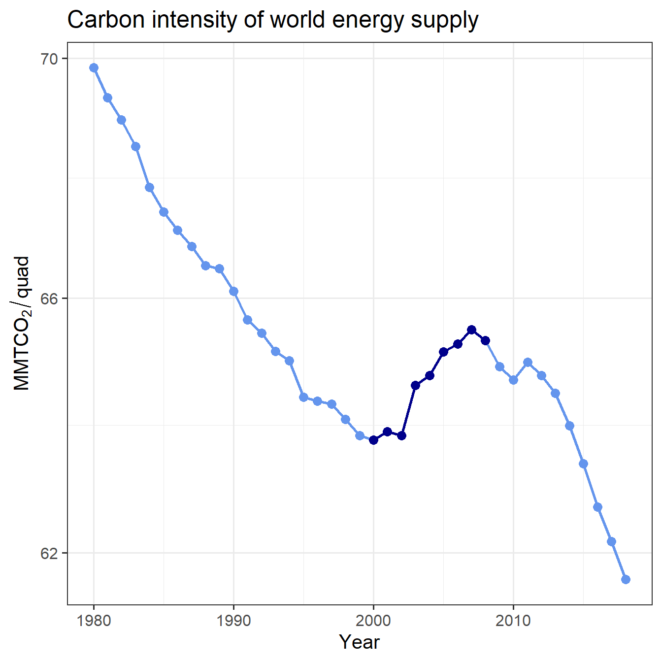
Figure 1: Trend of global carbon intensity, with 2000–2008 highlighted.
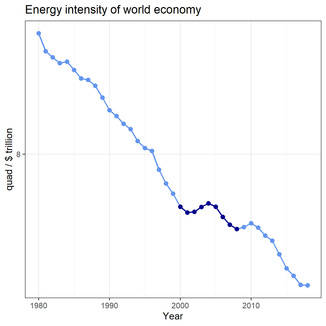
Figure 2: Trend of global energy intensity, with 2000–2008 highlighted.
China’s growth was fueled by a rapid expansion of energy consumption, and both factories and generating plants were very inefficient, and were largely fueled by coal. This drove both the energy intensity of China’s economy and the carbon intensity of its energy supply through the roof, and this appears to have played a large role in reversing for several years the global trend of declining energy and carbon intensity. Around 2007 or so, China’s energy and carbon intensity began to fall again and the world energy and carbon intensity fell along with it.
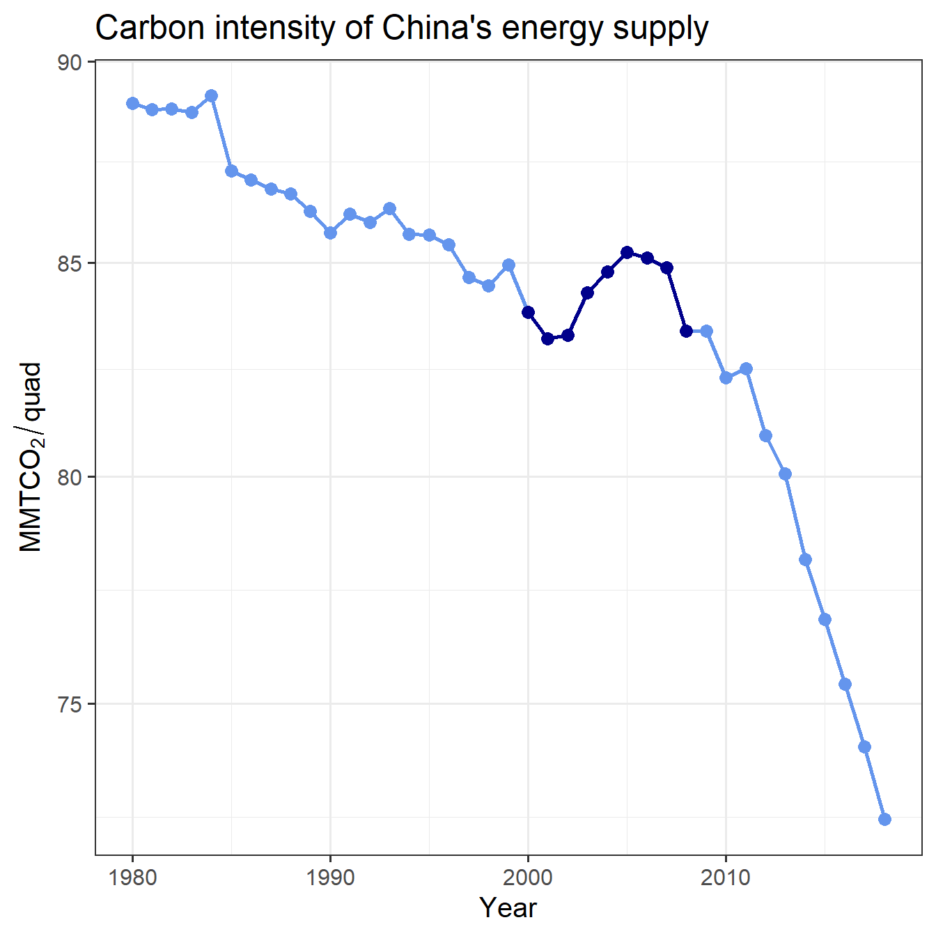
Figure 3: Trend of China’s carbon intensity, with 2000–2008 highlighted.
Note the very rapid decline in carbon intensity beginning in 2010.
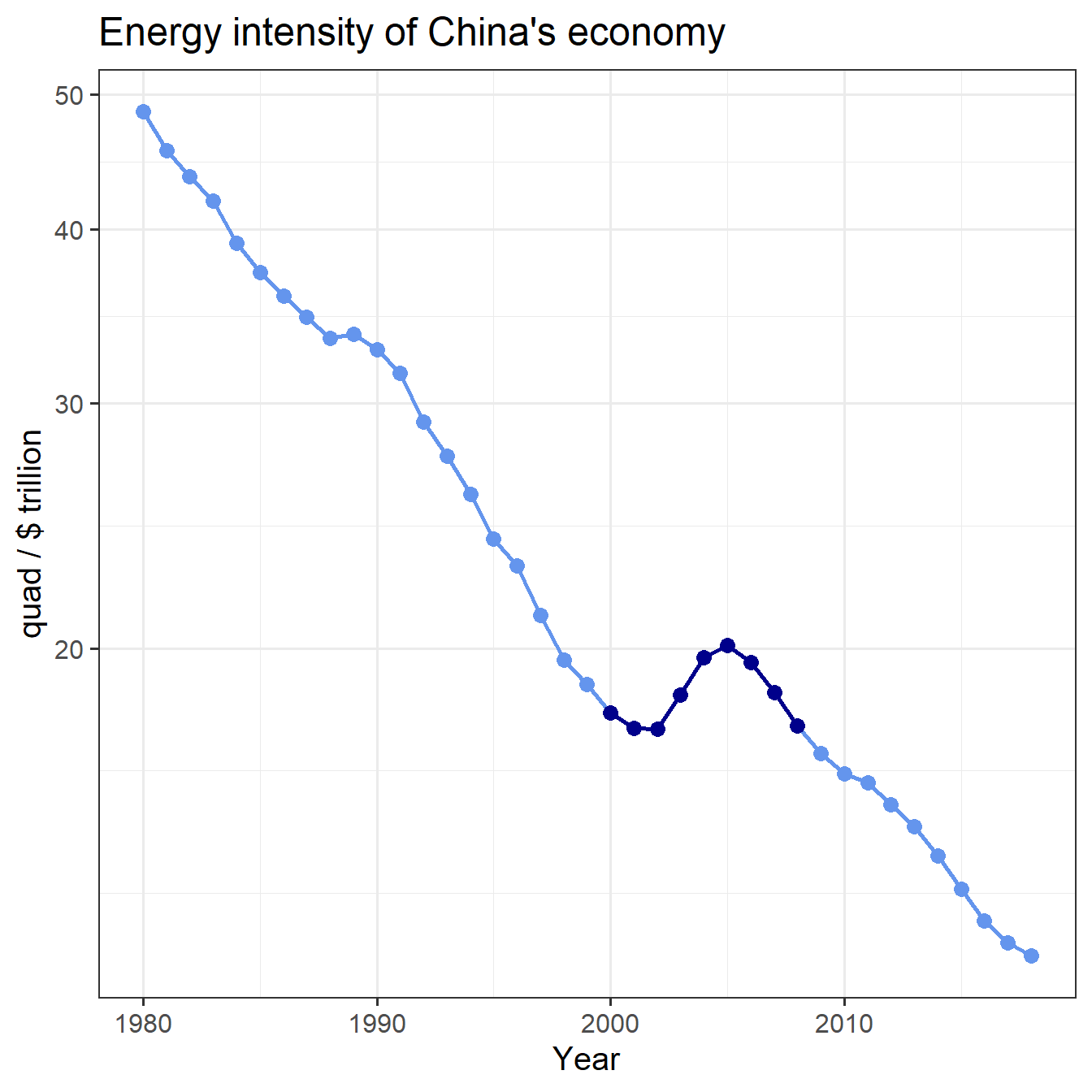
Figure 4: Trend of China’s energy intensity, with 2000–2008 highlighted.
And here are the trends for the whole world except China:
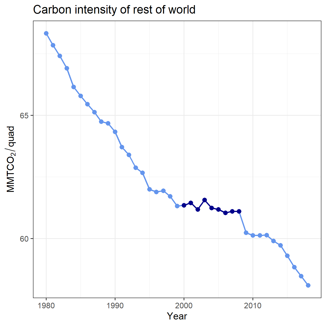
Figure 5: Trend of carbon intensity for the world except China, with 2000–2008 highlighted.
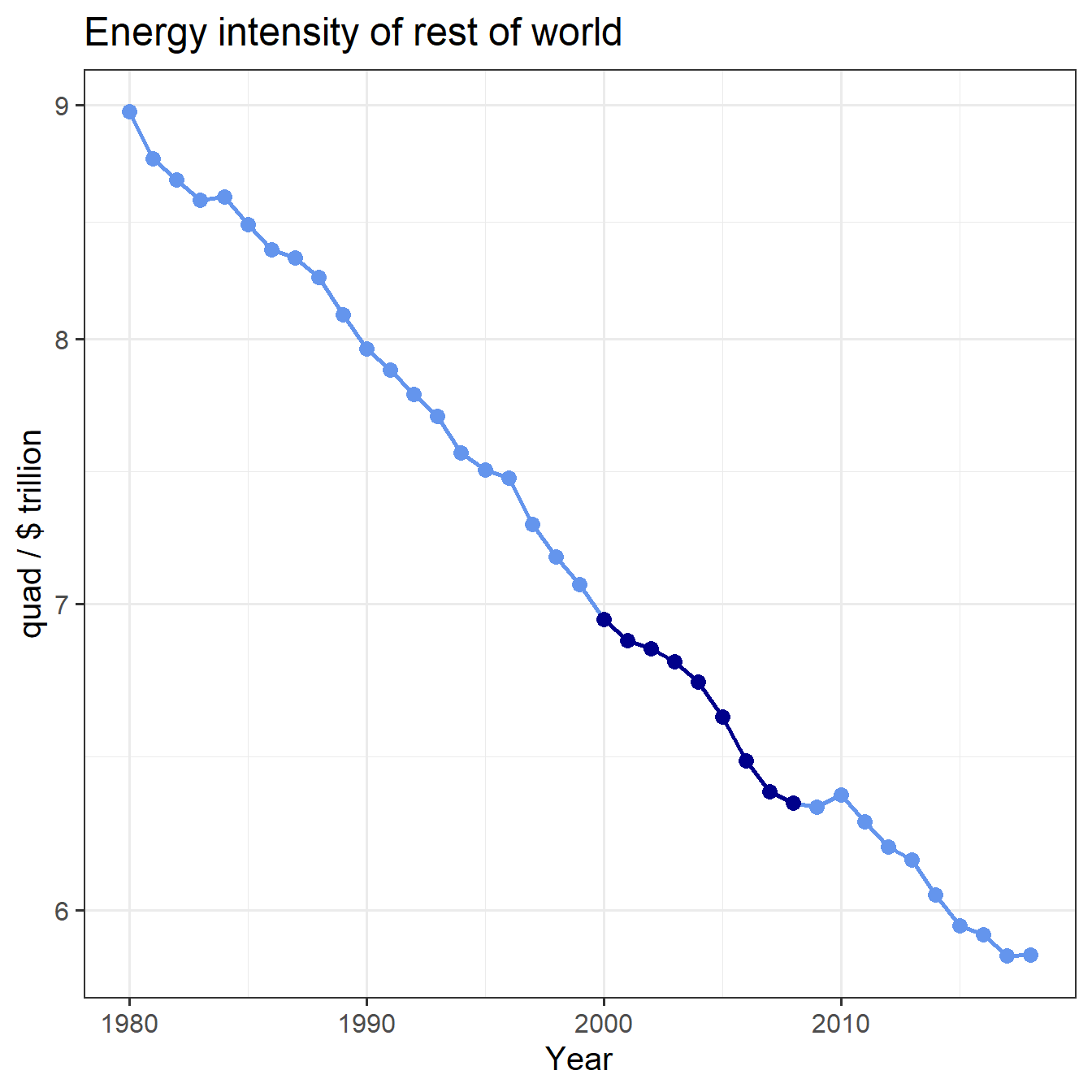
Figure 6: Trend of energy intensity for the world except China, with 2000–2008 highlighted.
An alternative analysis of the RCP scenarios, which takes the observed trend from 2005–2016, seems more sensible, both because it better matches the period in which we are calculating the implied decarbonization trends (the first 15 years of the RCP scenarios, from 2005–2020), and also because it avoids the anomalous temporary reversal of the historical trend from approximately 2002–2005.
Methods
To calculate carbon intensity and energy intensity, we need economic data for the scenarios, so to make things simple, we use the GCAM simulations of the RCPs. These are not identical to the official RCP data, but present reasonable scenarios that produce emissions trajectories very close to the RCPs. The GCAM versions of the pathways are calculated within a consistent macroeconomic model of regional economies and energy use, and thus facilitate comparisons of energy and carbon intensities.
Observed Historical Data
We get historical emissions data from the 2017 BP Statistical Review of World Energy and historical economic data from the World Bank.
Calculate Decarbonization Rates
From the Kaya identity, the energy intensity of the economy is given by \(e = E/G\), and the carbon intensity of the energy supply is given by \(f = F/E\), where \(E\) is the total primary energy consumption, \(F\) is the total carbon dioxide emissions, and \(G\) is the gross world product.
Fractional growth rates are given by \[ \begin{aligned} r_e &= \frac{\text{d} \ln e}{\text{d}t} \\ r_f &= \frac{\text{d} \ln f}{\text{d}t} \end{aligned} \]
We implied rates under RCP and GCAM scenarios from 2005–2020 and we calculate rates of observed (historical) change from 2005–2016.
Analysis
Now we have the data, so we plot the implied rates of decarbonization in the RCP and GCAM scenarios and compare them to the observed historical rates over the same time frame.
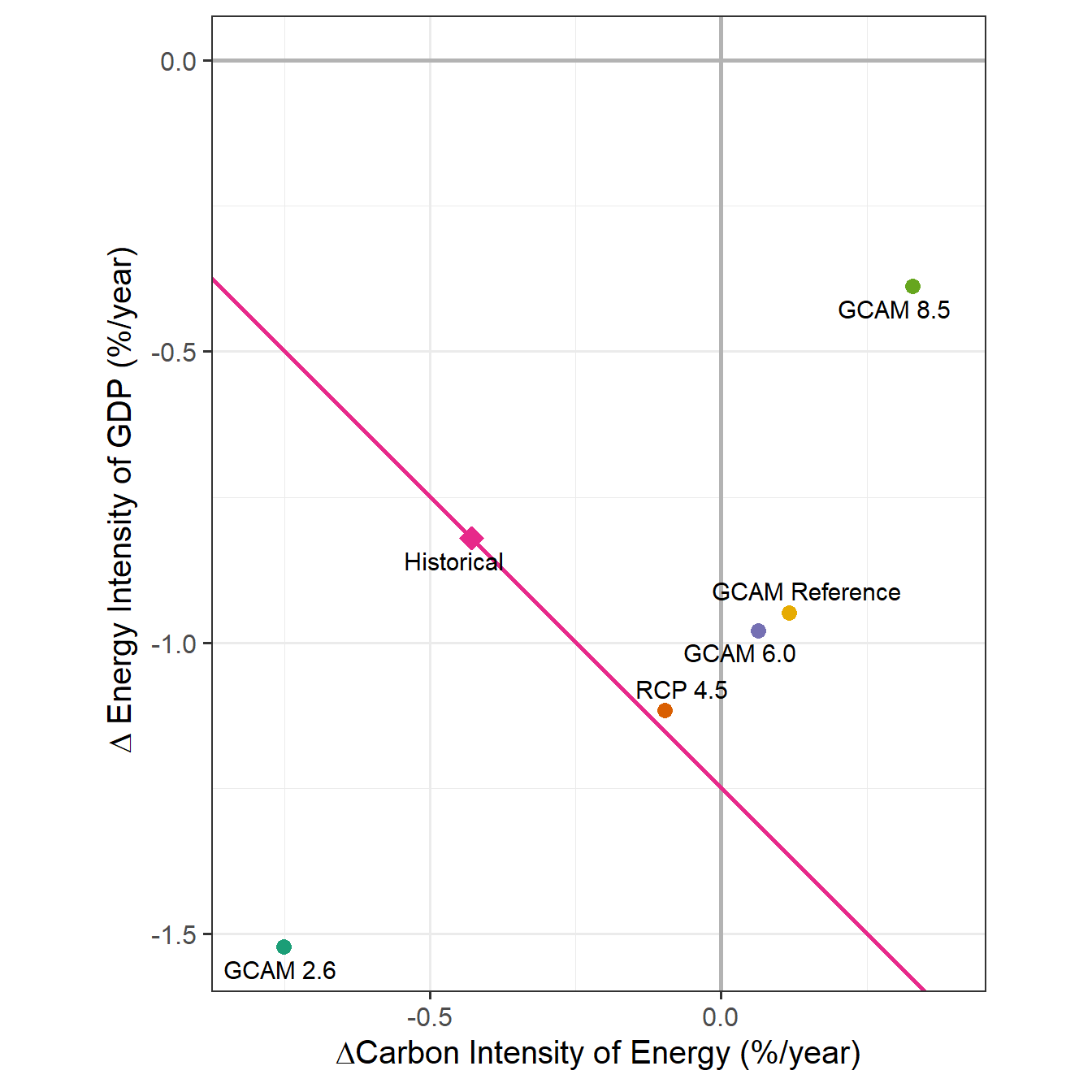
Figure 7: Observed vs. implied rates of decarbonization. RCP and GCAM rates are for 2005–2020 and Historical rate is for 2005–2016.
| Scenario | Decarbonization rate |
|---|---|
| Historical | -1.2% |
| GCAM Reference | -0.8% |
| GCAM 8.5 | -0.1% |
| GCAM 6.0 | -0.9% |
| RCP 4.5 | -1.2% |
| GCAM 2.6 | -2.3% |
Conclusions
In contrast to the previous work, using the last 8 years of observed data on energy and carbon intensity, the world appears to currently be headed along a trajectory is decarbonizing slightly faster than both the RCP 4.5 reference scenario and the RCP 6.0 policy scenario, and which not too far behind the early years of RCP 4.5 policy scenario (see Table 1).
Thus, the challenge of getting from the current trajectory to the RCP 4.5 policy trajectory seems actually to be a bit smaller than anticipated. This is very different from the conclusions of Pielke, Wigley, & Green and Stevenson & Pielke, and presents a much more optimistic picture than those analyses do.
Of course, the big cuts in the RCP 4.5 pathway occur in the future, so we should not take this as license for complacency. Much of the acceleration of decarbonization has been driven by the unexpected fracking revolution, which dramatically reduced the price of natural gas and thus stimulated a massive shift from coal to gas in electrical generation. Sustaining a long-term decarbonization trend will require a similar revolution in clean energy sources (nuclear and renewables) to replace gas.
Moreover, the anomalous reversal of spontaneous global decarbonization in the early 2000s may be repeated if other developing countries experience rapid industrialization and economic growth. This could happen in India and among African nations.
Nonetheless, if we consider that this analysis compares the observed spontaneous decarbonization rate (with no major climate policies) over the last eleven years to the decarbonization rates implied by the policy-regimes of the different RCP policy regimes, and if we also recognize that RCP 4.5 gives roughly 80% probability of keeping warming below 3.0°C, then this makes it much more plausible that we have time to avoid catastrophic damage.
This analysis also highlights challenges with respect to energy efficiency: the carbon intensity of the world’s energy supply has dropped much faster than either the baseline or any of the policy scenarios except GCAM 2.6. However, the energy intensity of the world’s economy has lagged far behind the reference scenario and all of the serious policy scenarios (the exception, GCAM 8.5 may be seen as reflecting perverse policies that encourage energy consumption and the use of coal). This is true at the global scale and also apparent for China, as shown in figures 3 and 4.
This is consistent with many experts’ views that policy measures will be more effective at reducing carbon intensity by promoting inexpensive clean energy sources than at slowing or reversing the growth of energy demand. However, one could also interpret this as a failure by both governments and markets to provide behaviorally effective incentives and opportunities for businesses and households to implement available energy-efficiency measures. Michael Vandenbergh and I argue for the latter interpretation in our recent book, Beyond Politics, where we present evidence that there is a large efficiency gap both in households and in businesses, and that there are significant opportunities to reduce emissions while saving money by systematically pursuing inefficiencies.
Code
The R code for the analysis in this post is available at https://github.com/jonathan-g/jonathangilligan.hugo/blob/master/content/post/2018-02-13-dangerous-assumptions-revisited.Rmd and an alternate version is available at https://github.com/jonathan-g/dangerous-assumptions-revisited